
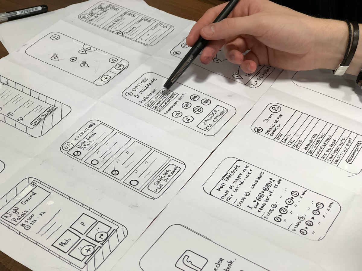
Every time you tap a link, scroll a feed, or click a video, you’re responding to decisions that someone else made. Those choices live in the layout, color schemes, recommendation systems, and even the microinteractions that make digital platforms feel intuitive—or manipulative. We often praise user-friendly design, but we rarely pause to ask, “Friendly for whom?” Behind every “seamless” digital learning experience lies a complex set of biases, whether intentional or not, that shape not only how we interact with information but also what we perceive as worth learning.
Higher education program curriculums now teach students to recognize and be more cognizant of such biases. St. Thomas University’s Master of Science in Instructional Design & Technology Online program, for example, prepares educators and professionals to understand these exact dynamics. It equips students with the tools to evaluate, design, and challenge the digital learning spaces shaping modern education.
Bias in Algorithms: A Feedback Loop
Search bars and recommendation engines might feel like shortcuts to the knowledge you want, but they come with built-in biases. Algorithms suggest content based on previous behavior, popularity, or profit potential—not necessarily educational value. This creates a feedback loop. The more users click on a topic, the more it appears. The less attention something gets, the more invisible it becomes. For those pursuing structured education, like the online master’s in instructional design and technology program at St. Thomas University, recognizing this loop matters. These learners must navigate not just course content but also algorithmic biases embedded in learning platforms, forums, and digital libraries. This fully online program delivers cutting-edge, forward-thinking instruction that stays aligned with today’s evolving technology landscape. It provides a concentrated foundation in systems thinking skills that apply directly to professional instruction and training across a wide range of industries.
The Myth of Neutral Interfaces
Designers love to talk about usability and user experience, but neutrality doesn’t actually exist in interface design. Every element, from where a button sits to how much scrolling a user must do, directs attention in specific ways. The layout can highlight some topics while burying others. This influence often goes unnoticed by users because it feels natural. But natural doesn’t mean neutral. When educational platforms claim to “let learners explore freely,” they’re often presenting paths shaped by designers’ assumptions. These silent nudges are more powerful than most realize.
The Power of Visual Hierarchy
Our eyes don’t move randomly across a webpage. They follow cues like font size, color contrast, and spatial arrangement. Visual hierarchy tells us what matters most—according to the designer. A bold headline grabs attention. A call-to-action button stands out in a bright color. On an educational site, that might mean users see beginner content more prominently while advanced topics stay hidden in drop-downs. If you’re studying online, this impacts how you engage with new material. Before you even make a conscious choice, the interface has guided your decision. These early interactions create habits, expectations, and eventually, learning patterns.
Dark Patterns in Learning Platforms
Not every design bias is accidental. Sometimes, designers use dark patterns—deceptive interface tricks meant to push users toward specific actions. You’ve seen them: the tiny “No thanks” next to the huge “Subscribe now” button, or the notification badges that create a false sense of urgency. In learning platforms, these tricks might encourage learners to spend more time watching partner-sponsored videos or steer them toward paid features rather than academic resources. While subtle, these patterns shape learning priorities. They blur the line between genuine curiosity and manipulated behavior. It’s hard to focus on deep learning when you’re being constantly redirected.
Information Architecture: Who Gets to Organize Knowledge?
The way a platform organizes its information—called its information architecture—acts as a digital filing system. Categories, tags, folders, and menus are not objective. They reflect someone’s mental model of how knowledge should be grouped and presented. When educational sites structure content around Western paradigms, for example, they sideline non-Western ways of thinking. This affects global learners trying to connect with content in meaningful ways. A poorly designed structure doesn’t just confuse users—it limits understanding. When a topic is hard to find, it’s often assumed to be less important. But in reality, it might simply be poorly positioned within the system.
Microinteractions and the Illusion of Choice
Every beep, swipe, or loading animation feels insignificant—until you realize these tiny design choices influence behavior more than large features. Microinteractions create rhythm and emotional responses. When a quiz flashes green for a correct answer or buzzes red for a wrong one, it subtly trains users to associate specific behaviors with rewards. In online education, this can foster compliance over critical thinking. Learners might rush through content to earn digital badges or dopamine hits instead of grappling with complex ideas. These interactions make users feel in control, but the system often limits real decision-making to a narrow path.
Interface design isn’t just about making things look good or work well—it’s about shaping experiences, perceptions, and outcomes. Every interaction in a digital learning environment reflects a series of choices made by unseen hands. These choices guide learners subtly, reinforcing norms, setting limits, and sometimes distorting intentions. Recognizing this invisible influence matters more than ever. As digital education grows, so does its power to mold understanding. Whether you’re designing courses or simply taking one, awareness is the first step. Only when we see the hands behind the screen can we start to demand better, more equitable, and truly learner-focused design.